Dark Mode
Flip the whole frontend dashboard between light and dark, and choose which dark palette your store uses.
The entire StoreSuite dashboard comes in light and dark, and switching takes one click on the sun / moon button in the top bar of any dashboard page.
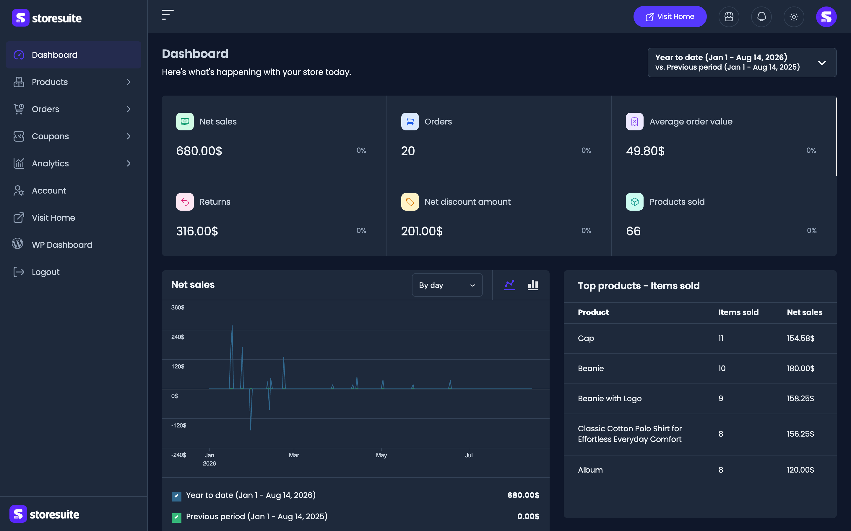
Three things worth knowing:
- Your choice sticks. StoreSuite remembers it in your browser, so the dashboard opens the way you left it.
- It is personal, not a store setting. You can work in dark while your shop manager stays in light.
- Your device gets the first word. Before you have touched the toggle,
StoreSuite follows your operating system’s
prefers-color-schemesetting. Click the toggle once and your choice takes over.
The theme resolves before the first paint, so there is no flash of the wrong colors while a page loads.
What it covers
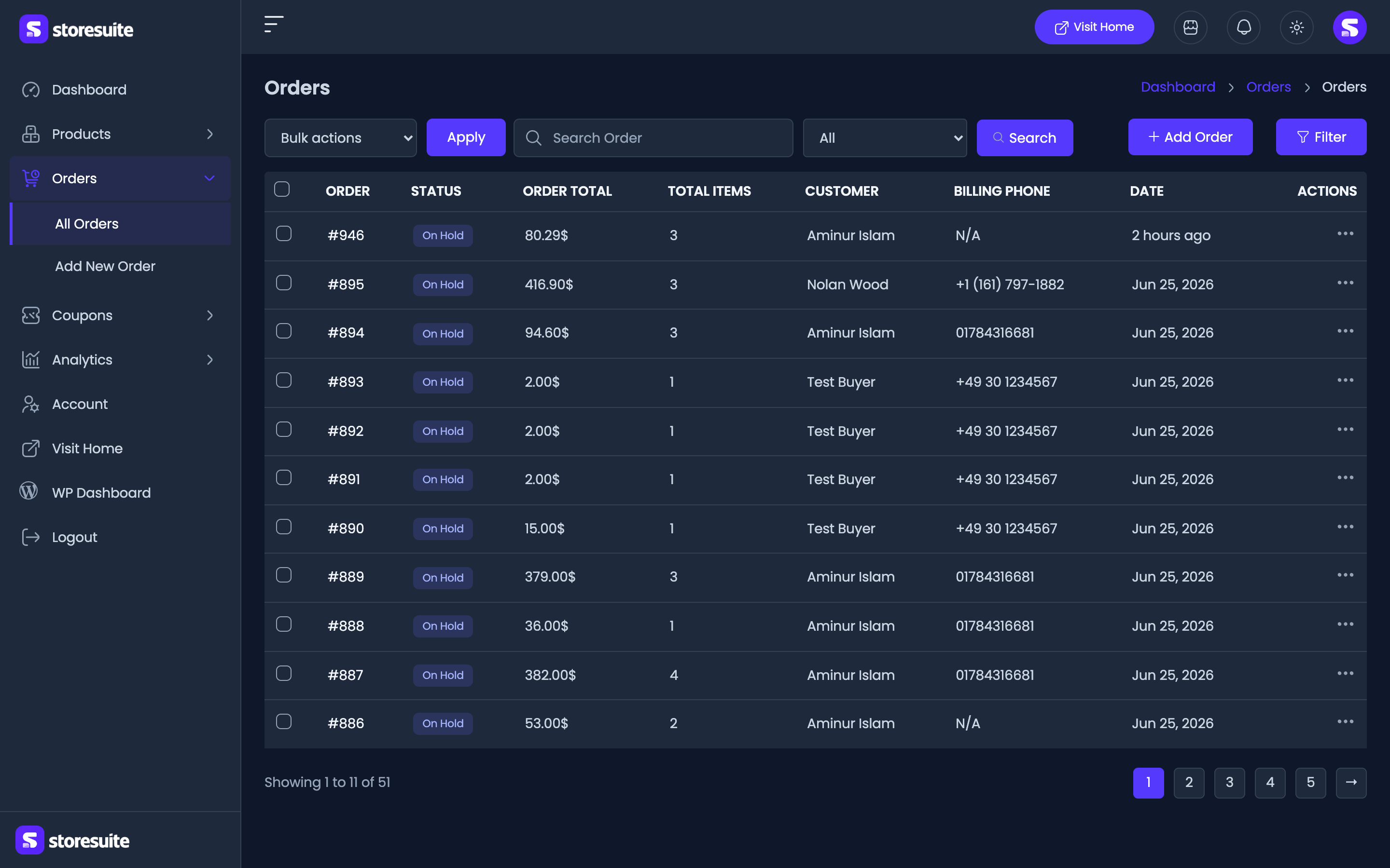
All of it, not just the main screens:
- Product, order, coupon, category, tag, and brand lists, with their filters and pagination
- The full product and order forms, quick edit, bulk edit, and the TinyMCE editor content
- Order details, account and address forms
- Dialogs, dropdowns, switches, badges, buttons, and the loading skeletons
- The complete Analytics suite - report charts, KPI tiles, data tables, advanced filters, the date-range picker, and interval selects
Choosing the dark look
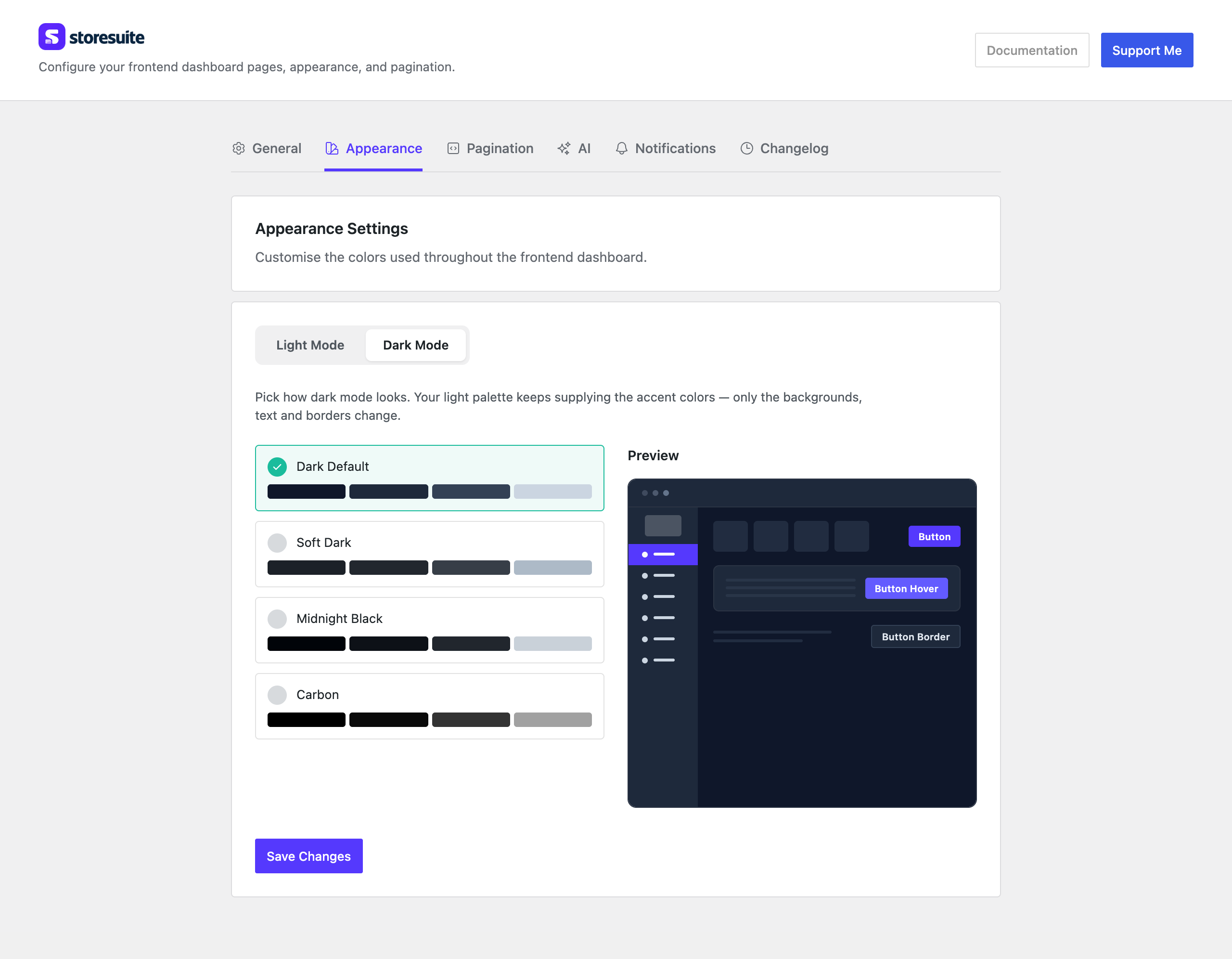
Dark mode is not one fixed shade. In wp-admin, go to WooCommerce → StoreSuite → Appearance and switch to the Dark Mode sub-tab to pick the one your store uses:
| Palette | The feel |
|---|---|
| Dark Default | Soft slate blue - the safe all-rounder |
| Soft Dark | Warmer and lower contrast, gentler for long sessions |
| Midnight Black | Near-black with crisp edges |
| Carbon | True black - deepest of the four, at its best on OLED screens |
The preview panel updates as you click, so you can compare before saving. Whichever you pick applies to everyone who switches their dashboard to dark.
Your brand color carries over
The dark palettes set the neutrals only - backgrounds, surfaces, text, and borders. Your accent color (buttons, the active sidebar item) comes from the Light Mode palette on the same tab, so choosing a dark palette never undoes your branding. There is no custom-color option on the dark side for that reason.
Keeping your logo readable
A logo drawn for a light sidebar can vanish against a dark one. Under WooCommerce → StoreSuite → General, both Dashboard sidebar logo and Dashboard sidebar icon carry a Light mode / Dark mode switch above the image. Flip it to Dark mode, upload a light-colored version, and StoreSuite swaps to it automatically whenever the dashboard is in dark mode.
Leave the dark slot empty and your regular image is used in both themes - fine if your logo already reads well on dark.
Tips
Try the palettes with real data on screen: an orders list full of colored status badges tells you more than the preview does. And if a teammate says the dashboard “looks wrong”, check the toggle first - they may have inherited dark mode from their computer’s system setting.